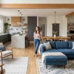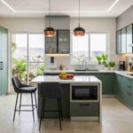
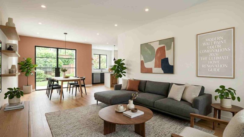
Finding the right modern wall paint color combinations 2026 is the absolute foundation of a successful home makeover. If you are planning a renovation this year, understanding how colors impact mood, spatial perception, and natural light is crucial. Wall colors do not just cover your surfaces; they define how your furniture, modular setups, and decor interact to create a cohesive environment.
In this ultimate guide, we will break down the defining design shifts of the year, explore room-by-room palettes, and show you exactly how to execute a flawless premium look in your home.
The Evolution of Interior Palettes: What Is Changing This Year?
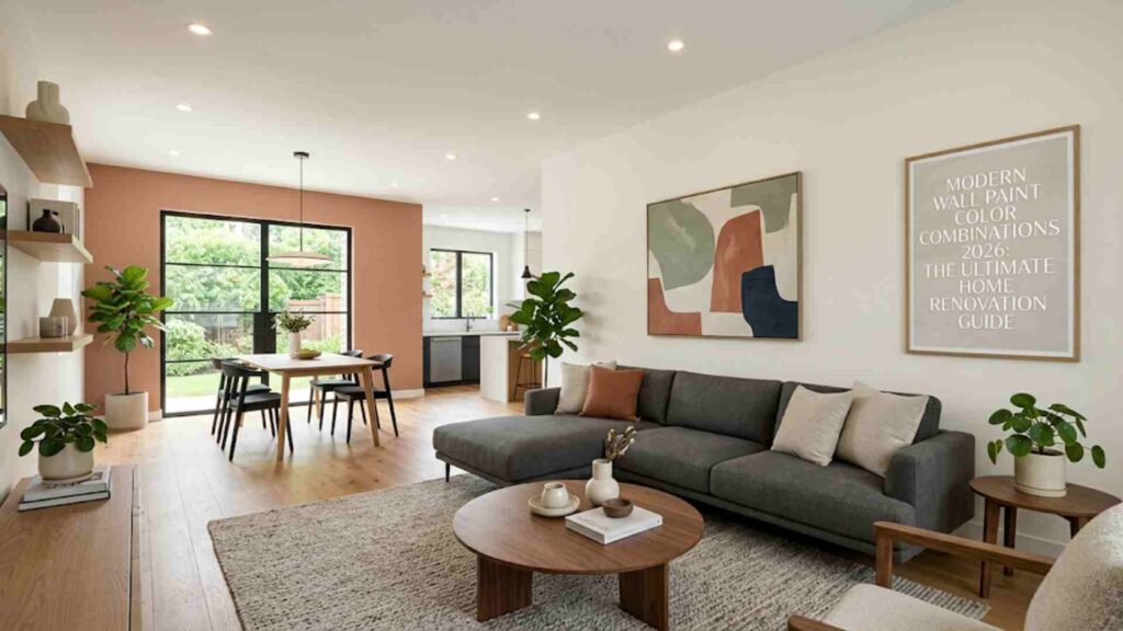
Interior design is moving away from cold, sterile aesthetics. For years, stark whites and icy grays dominated modern homes, often creating spaces that felt more like clinical laboratories than welcoming sanctuaries. This year marks a definitive shift toward warmth, organic connection, and rich tactile depth.
Why Earthy and Organic Tones Are Leading the Market
Homeowners are looking to create environments that offer an escape from digital fatigue. Consequently, we are seeing a major rise in grounding, nature-inspired hues. Mineral-rich terracotta, warm clay, soft sage, and deep forest greens are replacing flat neutrals. These shades don’t just sit on the wall; they change throughout the day as natural light shifts, adding a living, breathing character to your home architecture.
The Role of Texture, Matte Finishes, and Lighting
Color is no longer independent of finish. In 2026, ultra-matte and low-sheen eggshell finishes are highly preferred for interior walls. A matte finish absorbs light rather than reflecting it, which softens the intensity of deeper colors and hides minor surface imperfections.
Furthermore, the rise of architectural lighting—such as warm profile lights, concealed COB ceiling lights, and strategically placed sconces—means wall colors must act as canvas backdrops that complement soft, layered illumination.
Trend Forecast: Modern Wall Paint Color Combinations 2026
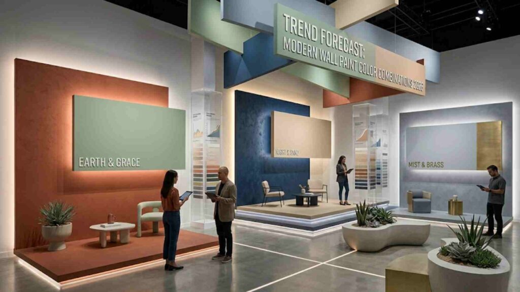
To help you visualize your next home renovation, let’s explore the core color stories driving modern interior design. These master palettes are curated to match contemporary furniture, premium materials, and open-plan layouts.
1. The Warm Minimalist Palette
- Primary Wall: Warm Alabaster White
- Accent Wall: Soft Greige or Taupe
- Trims & Ceilings: Muted Cream
This combination is perfect for those who love clean, uncluttered spaces but want to avoid a cold atmosphere. By using an alabaster white with warm yellow or pink undertones instead of a stark blue-toned white, the room feels instantly inviting. Pair this with light oak wood floors, linen curtains, and minimalist furniture for an effortlessly premium look.
2. The Biophilic Sanctuary Palette
- Primary Wall: Ethereal Sage Green
- Accent Wall: Deep Olive or Rich Forest Green
- Trims & Ceilings: Pure Off-White
Biophilic design—the practice of connecting indoor spaces with the natural world—remains incredibly popular. Using varying tones of green creates a soothing, restorative environment. This palette serves as a spectacular backdrop for indoor plants, natural stone accents, and brass or gold hardware fittings.
3. The Rich Earth & Terracotta Palette
- Primary Wall: Muted Sandstone Neutral
- Accent Wall: Burnt Terracotta or Warm Clay
- Trims & Ceilings: Soft Ivory
If you want to add an immediate sense of luxury and coziness, rich earth tones are the way to go. A terracotta accent wall adds incredible depth to a living room or entry lounge. It works beautifully when contrasted with modern low-profile charcoal sofas, matte black decor elements, and warm indoor lighting.
Living Room Palettes: Modern Wall Paint Color Combinations 2026
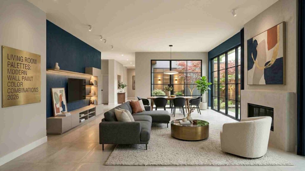
The living room is the undisputed heart of the home—it is where you entertain guests, relax after a long day, and spend quality time with family. Therefore, your living room paint scheme needs to be both visually striking and universally comfortable.
Elevating the Lounge with Sophisticated Neutrals
When working with a spacious living room, using a single flat color can make the space look boring. Instead, use a tone-on-tone approach. Paint your main walls in a sophisticated biscuit beige or soft greige. For the television backdrop wall or the main seating wall, opt for a deeper variant of the same tone or introduce a subtle lime-wash texture. This simple design choice creates instant luxury without overwhelming the eyes.
Creating High-Contrast Statement Walls Safely
If you love bold colors like deep midnight blue, rich emerald, or sophisticated charcoal, the living room is a great place to showcase them. However, balance is vital. If you choose a dark charcoal for your primary accent wall, keep the remaining three walls light and warm. Ensure your ceiling is painted in a crisp, complementary off-white to maintain an open, airy feeling and prevent the room from feeling like a cave.
Bedroom Sanctuaries: Modern Wall Paint Color Combinations 2026
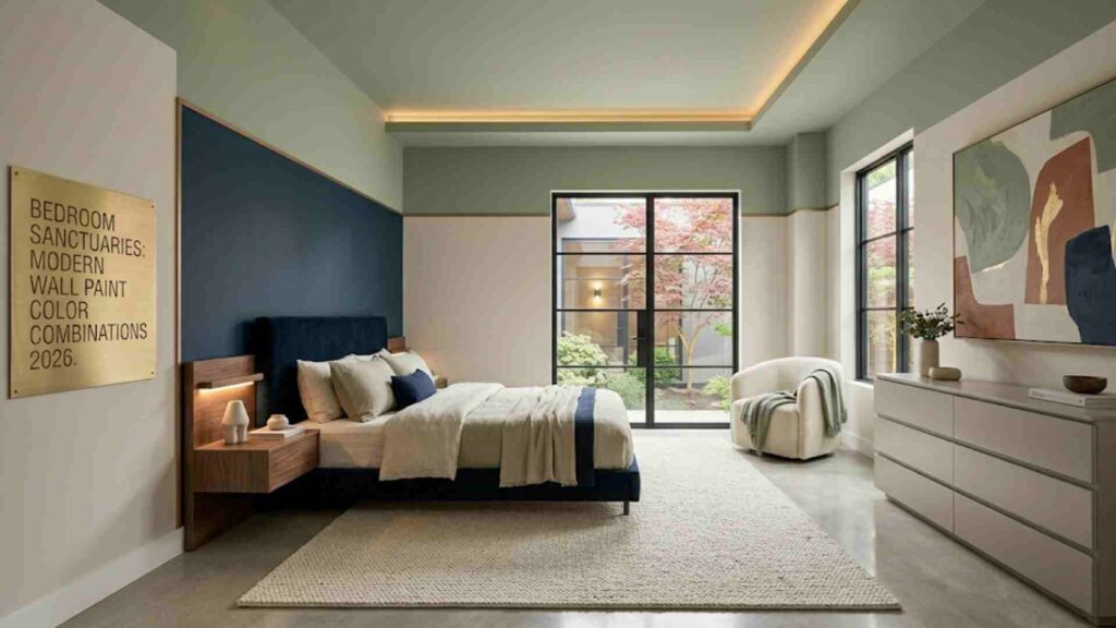
Your bedroom should be a private sanctuary designed explicitly for rest, recovery, and deep sleep. When choosing colors for this space, prioritizing psychological comfort and calming visual weight is essential.
Deep, Calming Hues for Master Bedrooms
Many homeowners are moving away from bright, energetic colors in the bedroom. Instead, rich, enveloping shades are taking over. Consider a combination of dusty steel blue on the headboard wall, paired with soft misty gray on the surrounding walls. Blue tones are scientifically proven to lower heart rates and encourage relaxation, making them an ideal choice for creating a peaceful retreat.
Creating Cozy Guest Rooms with Soft Pastels
For guest bedrooms, you want a palette that feels welcoming to anyone. Soft, sophisticated pastels are an excellent choice here. Think of a combination featuring muted lavender or a delicate dusty rose accent wall, balanced by warm cream primary walls. This configuration feels intentional, premium, and calm, ensuring your guests feel right at home.
Heart of the Home: Kitchen Palettes for 2026
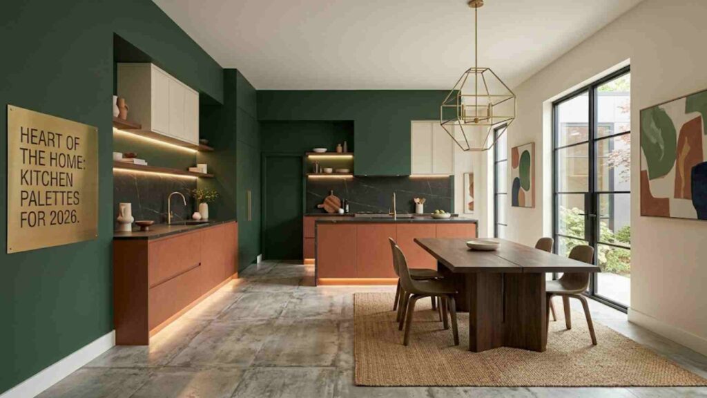
The modern kitchen has evolved from a closed-off utility space into an open-plan social hub that blends into the dining and living areas. Because of this, kitchen wall colors must coordinate flawlessly with modular cabinetry, countertops, and appliances.
Harmonizing Walls with Modular Cabinetry and Countertops
When planning your kitchen layout, look at your cabinetry finishes first. If your modular kitchen features rich wood grains or matte charcoal laminates, your wall paint should remain clean and supportive. A soft linen white or a pale grey-green ensures that your premium cabinetry remains the star of the show while keeping the workspace feeling bright and clean.
The Rise of Two-Tone Kitchen Palettes
Two-tone designs are dominating modern kitchens. A popular layout involves using a deep color for the lower cabinets (like navy blue or olive green), a lighter tone for the upper cabinets (like fluted glass or white laminate), and a soft, neutral wall paint that bridges the two. This layout keeps the visual weight at the bottom, making your kitchen ceilings appear much taller than they actually are.
Visualizing the Trends: Color Comparison Matrix
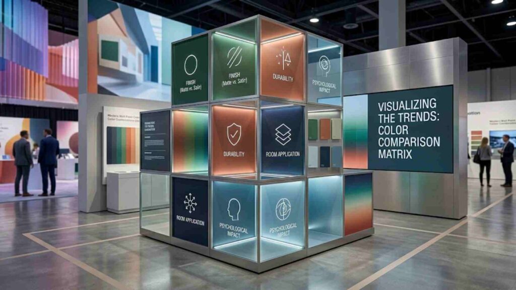
To make your decision process simpler, here is a breakdown of how the top color combinations behave across different spaces and lighting conditions.
| Palette Name | Primary Wall Color | Accent Wall Color | Best Suited For | Ideal Lighting Condition | Recommended Vibe |
| Warm Minimalist | Alabaster White | Soft Greige / Taupe | Living Rooms & Corridors | Bright, Natural Sunlight | Clean, Airy, Premium |
| Biophilic Oasis | Ethereal Sage | Deep Olive / Forest Green | Master Bedrooms & Studies | Soft, North-Facing Light | Calming, Organic, Serene |
| Desert Warmth | Sandstone Beige | Burnt Terracotta / Clay | Dining Rooms & Lounges | Warm, Artificial COB Lights | Cozy, Inviting, Luxurious |
| Urban Executive | Light Misty Gray | Midnight Blue / Charcoal | Home Offices & Media Rooms | Controlled, Integrated LED | Sharp, Focused, Elegant |
Small Space Optimization: Modern Wall Paint Color Combinations 2026
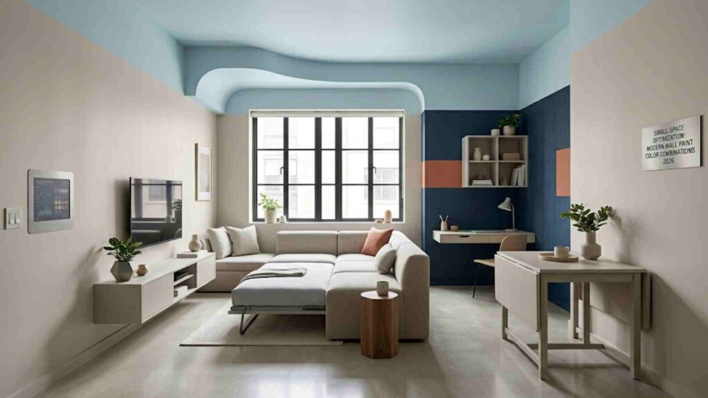
Painting a compact apartment or a smaller room requires a specific strategic approach. A common misconception is that you must only use stark white to make a room look bigger. In reality, pure white in a dark, small room can make it look dull and gray.
Using Monochromatic Schemes to Visual Scale a Room
One of the most effective designer tricks for small spaces is the monochromatic paint technique. By painting your walls, baseboards, trim, and even doors in the exact same color (using a durable satin or semi-gloss finish for the trim and matte for the walls), you eliminate visual boundaries. Because the eye doesn’t jump between contrasting trims and walls, the room instantly feels larger and more cohesive.
The Smart Way to Use Accent Colors in Tight Spaces
You can absolutely still use bold accent colors in small rooms. Instead of painting a traditional full accent wall—which can sometimes slice a small room in half visually—consider painting a specific architectural feature. Painting a reading nook, the interior of a built-in bookshelf, or a partial geometric block behind your bed adds incredible design character and depth without overwhelming the limited square footage.
Lighting Dynamics: How to Choose and Test Your Wall Paint
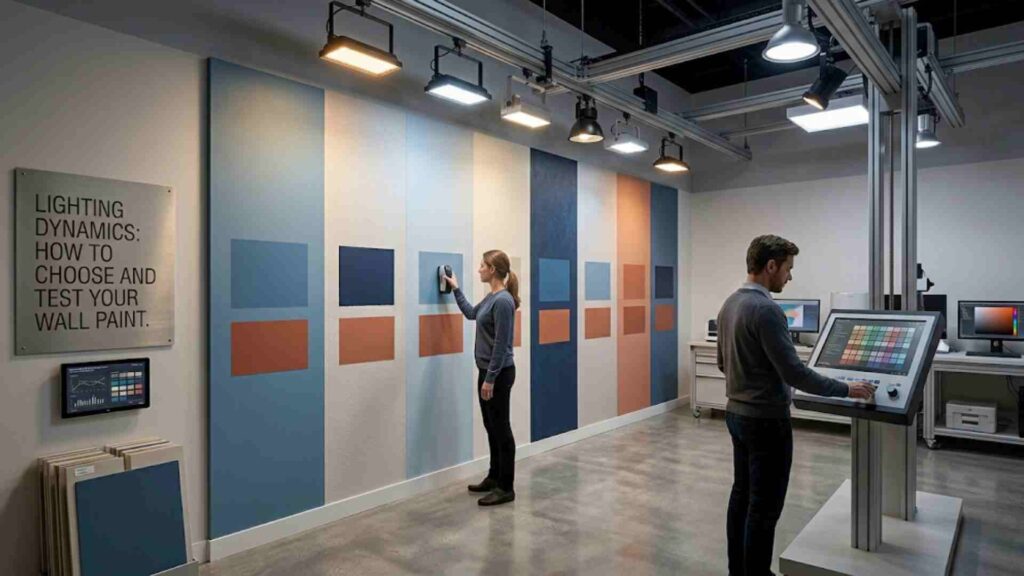
A color swatched in a retail paint store will look completely different when applied to your actual living room wall. This discrepancy occurs because color is entirely dependent on the light reflecting off it.
Natural Light vs. Artificial Light Behavior
Before finalization, observe how light travels through your rooms:
- North-Facing Rooms: These spaces receive cool, bluish natural light all day. To counteract this chilliness, look for warm neutrals, soft pinks, or yellow-based creams.
- South-Facing Rooms: These areas enjoy intense, warm sunlight. They can easily handle cooler tones like slate grays, crisp whites, and soft blues, which balance out the blazing sun.
- Artificial Illumination: Remember that warm yellow lights (2700K – 3000K) will turn cream walls yellow and mute blue tones. Neutral white lights (4000K) provide the most accurate representation of your selected paint color.
The Foolproof “Sample Board” Testing Method
Never paint your color samples directly onto your raw wall. The existing wall color will bleed through the thin sample coats and distort your perception of the new shade. Instead, buy small sample pots and paint two coats onto large white cardboard sheets. Move these sheets around your rooms throughout the day, holding them against your flooring, curtains, and furniture to see exactly how the colors perform in real life.
Conclusion: Crafting Your Timeless Space
A successful home renovation is not about blindly following every passing trend; it is about finding the perfect overlap between modern design aesthetics and your own personal comfort. The modern wall paint color combinations 2026 highlight a collective desire for homes that feel warm, grounding, and uniquely full of character. By pairing rich, earthy tones or clean, warm minimalists with the right finishes and architectural lighting, you can transform your property into a stunning, premium sanctuary that will look fresh and beautiful for years to come.
Frequently Asked Questions (FAQs)
1. Which modern wall paint color combinations 2026 are best for open homes?
Use a single warm neutral (like greige or ivory) for the main walls to maintain flow. Then, highlight specific zones—like a dining area or TV wall—with a soft accent color like sage green.
2. How do I choose the right paint finish?
- Matte: Best for bedrooms and ceilings. It hides flaws perfectly but is hard to clean.
- Eggshell: Ideal for living rooms and halls. It looks premium and wipes clean easily.
- Satin: Best for kitchens and bathrooms. It resists moisture and is highly washable.
3. Will dark modern wall paint color combinations 2026 shrink a small room?
No. A deep color like charcoal or midnight blue on a single wall creates an illusion of depth, making the wall look further away. Just keep the other walls light and add warm lighting.
4. What colors match wooden furniture and indoor plants?
Earthy tones work best. Choose soft sage green, sandstone beige, or muted terracotta. These shades naturally balance rich wood grains and green plants to create a luxury look.